2024-10-10
If we want to create a forecast in R for the TSA Passenger data to predict future volumes, we can use the tidyverts packages fable, tsibble, and feasts.
These packages apply tidy data principles to time series data and forecasting. They were coauthored by the forecasting great Rob Hyndman. If you are interested in learning more about forecasting, I highly recommend Rob Hyndman and George Athanasopoulos's fantastic textbook: Forecasting: Principles and Practice (3rd Edition) (FPP3), which uses these tidyverts packages and workflows.
We have monthly TSA Passenger data from 2019 to September 2024, and it looks like this:
                    autoplot(df, passengers) +
                        ggtitle("TSA Passenger History") +
                        scale_y_continuous(
                            name="Passengers",
                            labels=label_number(scale_cut = cut_short_scale())
                        ) +
                        theme(axis.title.x = element_blank())
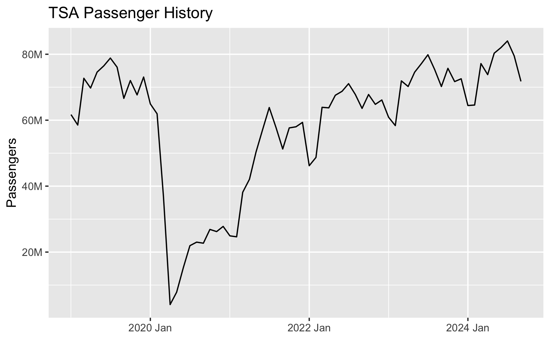
We do have the data at a daily level, but for this exercise we're just forecasting monthly.
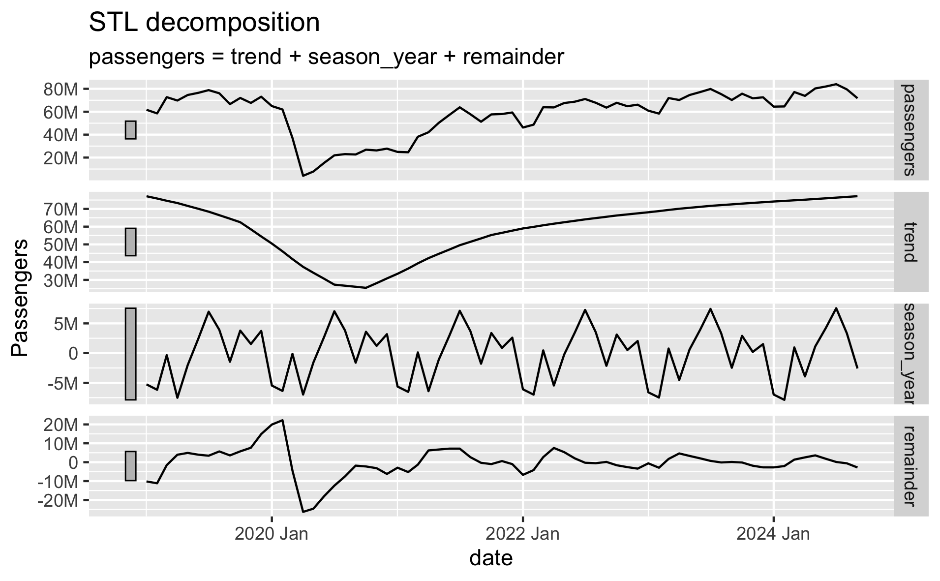
There is clear seasonality in the data, and there has been an upward trend coming out of the Covid downturn.
                    # Time series decomposition
                    dcmp <- df |>
                        model(stl = STL(passengers))

                    components(dcmp) |>
                        autoplot() +
                        scale_y_continuous(
                            name="Passengers",
                            labels=label_number(scale_cut = cut_short_scale())
                        )
The fable package provides several time series models to choose from. We can evaluate which models perform the best by breaking our data into separate train/test sets. We fit each model on the training data, generate a forecast from each model over the test set time period, and evaluate each model's forecast against our test set to measure accuracy.
We'll start with four simple baseline models that allow us to compare our more complex models against simple but still effective baselines. We'll use the ARIMA function to find the best fitting ARIMA model, and we'll try four different ETS models. We know that trend and seasonality are likely to continue, so we will limit ourselves to just these ETS models, but you could try others. Alternatively, the ETS() function can select the best-fitting ETS model for you, just like the ARIMA() function.
We recently learned that our models will likely perform best if we ignore pre-Covid data and just assume history begins at April 2020. So we will use that in our model selection and final forecasts here.
                    # Forecast with fable
                    fit <- train |> model(
                        # Baseline models
                        mean = MEAN(passengers),
                        naive = NAIVE(passengers),
                        drift = NAIVE(passengers ~ drift()),
                        snaive = SNAIVE(passengers),
                        # tslm = TSLM(passengers ~ trend() + season()),

                        # Auto-ARIMA and Auto-ETS models
                        arima = ARIMA(passengers, stepwise=FALSE, approximation=FALSE),
                        # ets = ETS(passengers),

                        # ETS models
                        ets_aaa = ETS(passengers ~ error('A') + trend('A') + season('A')),
                        ets_aada = ETS(passengers ~ error('A') + trend('Ad') + season('A')),
                        ets_aam = ETS(passengers ~ error('A') + trend('A') + season('M')),
                        ets_aadm = ETS(passengers ~ error('A') + trend('Ad') + season('M'))
                    )

Thankfully our ARIMA and ETS models do mostly outperform our baselines! The ets_aada and ets_aaa models perform the best. The models with multiplicative seasonality don't perform as well and actually underperform some of our baselines - they also seem to take much longer to fit and forecast. The arima model underperforms the seasonal naive baseline model, but outperforms the rest.
One nice feature of fable is that it makes it very easy to combine or ensemble multiple forecast models. Hyndman and Athanasopoulos describe the benefits of this as such:
"The results have been virtually unanimous: combining multiple forecasts leads to increased forecast accuracy. In many cases one can make dramatic performance improvements by simply averaging the forecasts."
Based on our results, we'll try creating combined forecasts of the arima model with each of the two best performing ETS models: ets_aada and ets_aaa.
                    # Create combined models
                    fcst <- fit |> mutate(
                        arima_ets_aaa = (arima + ets_aaa) / 2,
                        arima_ets_aada = (arima + ets_aada) / 2,
                    ) |> forecast(h = months_to_forecast)

                    # View model forecast accuracy against test set
                    accuracy(fcst, df) |>
                        arrange(RMSE)
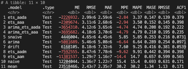
After adding in our two combined models, the plain ETS models still perform the best. But the combination models are right behind them.
We can plot the forecasts from the ARIMA, combination, and top ETS models to see how they compare to the historical actuals in our test data:
                    autoplot(filter(fcst, .model %in% c(
                        'arima',
                        'ets_aaa',
                        'ets_aada',
                        'arima_ets_aaa',
                        'arima_ets_aada'
                    )), df, level = NULL) +
                        ggtitle("Top Forecast Models by RMSE on TSA Passenger Test Data") +
                        scale_y_continuous(
                            name="Passengers",
                            labels=label_number(scale_cut = cut_short_scale())
                        ) +
                        theme(axis.title.x = element_blank())
The models are generally overshooting what has actually happened so far in 2024, which would be reasonable if the existing trend from 2021 to 2023 were to just continue. 2023 was the first year to fully recover back to 2019 levels, so 2024's growth is going to be more organic growth rather than recovery from Covid. Since the model only has data from 2020 through 2023 in its training set, it doesn't know that growth will steady in 2024 since we've hit pre-Covid levels.
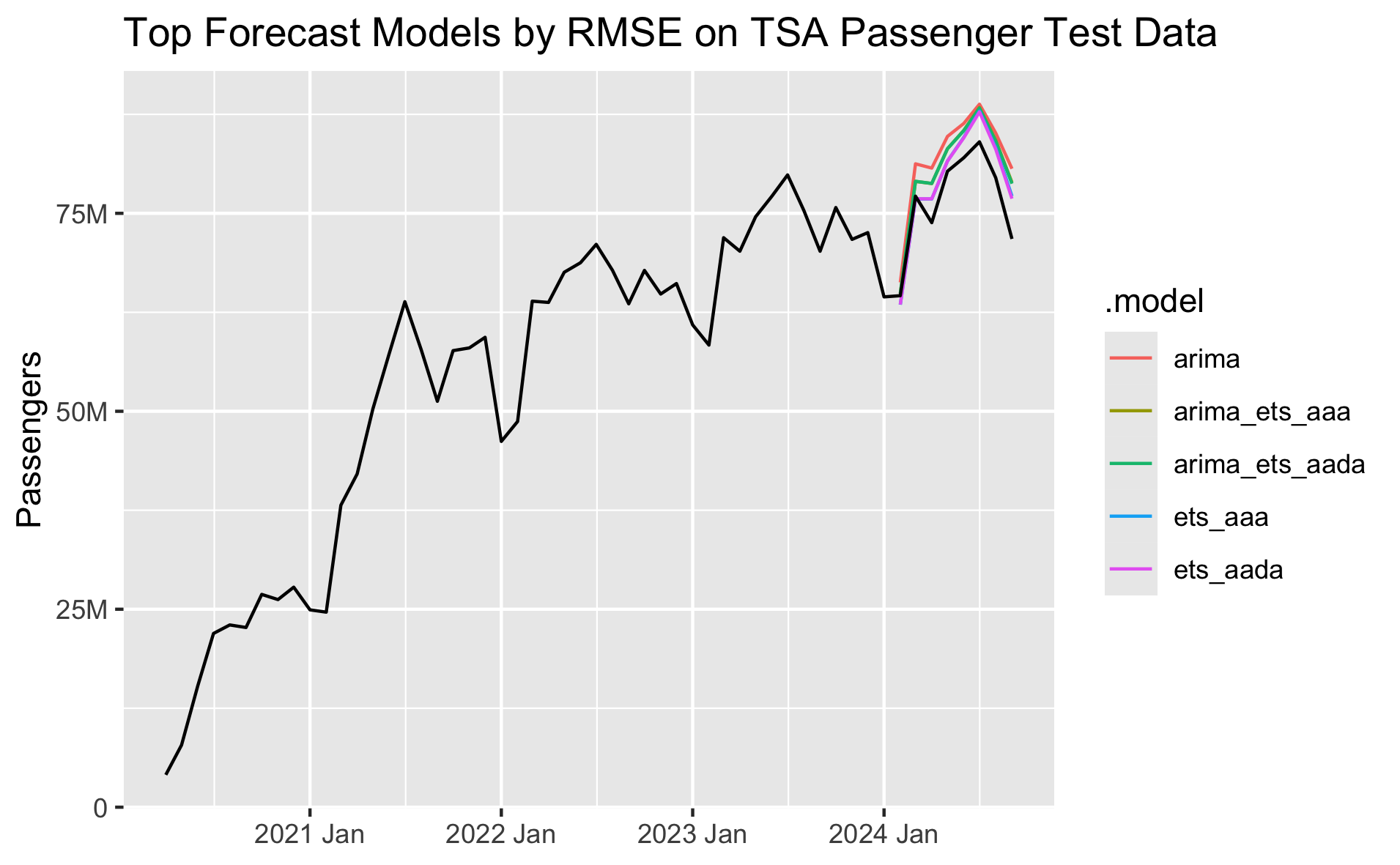
Based on these results, I would pick either the top-performing ets_aada model or the combined arima_ets_aada model. While the ets_aada model is more accurate compared to the test set right now, over the long term I would probably prefer an ensemble. As I've worked on this forecast over the past couple months, the top performing model can swap between ETS and ARIMA as we get new data each month. So long-term I'd prefer to use an ensemble model that takes both ARIMA and ETS approaches into account.
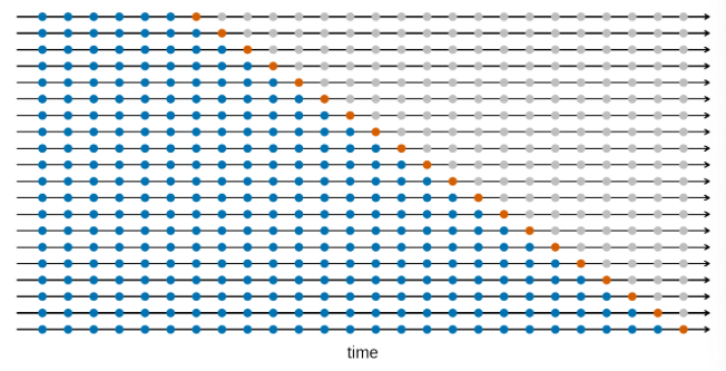
Another approach to time series model evaluation is cross-validation. This is a little different from the cross-validation you may have used in other machine learning contexts. For cross-validation with time series data, we start with an initial base set of only n historical data points, fit our models, calculate forecasts, and measure accuracy. We then repeat the process by adding one additional data point (or more) to the base set of historical data with each step, fit the models, forecast, and measure accuracy. In each iteration we're forecasting one or more steps out. Hyndman and Athanasopoulos use the visualization below in FPP3 to help explain the process. The blue dots are the base history we're using to fit our models in each iteration, and the orange dots are the future points we're trying to estimate:
One neat benefit of this approach is that if we're forecasting more than one step ahead in each iteration we can see the average model accuracy across all of the CV sets at 1 to n steps out.
                    # Plot forecast accuracy by months out
                    accuracy(fcst |> group_by(h), df) |>
                        filter(!(.model %in% c(
                            'drift',
                            'mean',
                            'naive',
                            'snaive',
                            'tslm'
                        ))) |>
                        ggplot(mapping = aes(x = h, y = RMSE, color = .model)) +
                        geom_line() +
                        labs(
                            title = "TSA Passenger History",
                            x = "Forecast RMSE N Months Out"
                        ) +
                        scale_y_continuous(
                            name="RMSE",
                            labels=label_number(scale_cut = cut_short_scale())
                        ) +
                        scale_x_continuous(
                            breaks = seq(1, 12)
                        ) +
                        theme(panel.grid.minor = element_blank())
As we'd expect, model accuracy gets worse the further out we try to forecast. We can see how the models compare at different future forecast steps in the chart below. The best performing model across the CV sets is the ETS(A,Ad,A) model, and the second best is the combination of ARIMA and ETS(A,Ad,A).
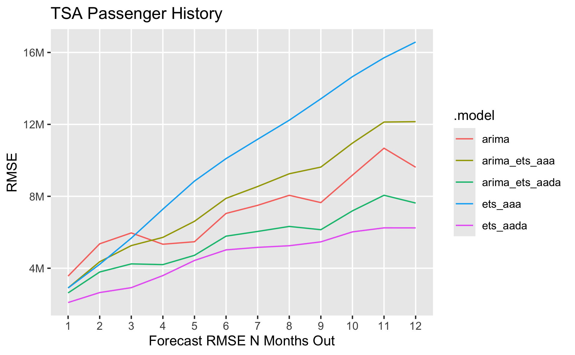
The total model accuracy across all CV steps and forecast periods is below. It's also possible to calculate the accuracy just for n specific forecast steps out if needed.

Based on what we've seen by evaluating different models with a train/test split and cross-validation, we know that the ARIMA and ETS(A,Ad,A) models tend to perform the best, along with the combination of the two. Ultimately, I would choose the combination of the two so that we can hopefully gain from the benefits of ensembling over the long term.
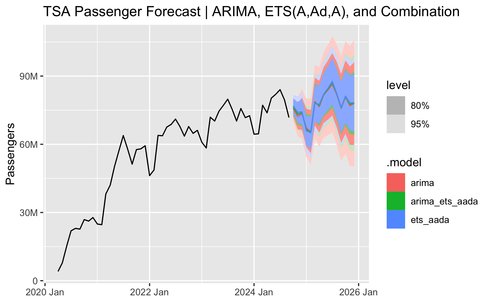
Let's perform a final forecast, fitting ARIMA and ETS(A,Ad,A) models on the full dataset and then combining them. The chart below shows the forecast from October 2024 to December 2025 for the three models. The arima forecast is slightly lower and the ets_aada forecast is slightly higher. The combined model, being the average of the two, runs through the middle. The 80% and 95% prediction intervals are shown by default in the autoplot() function in the tidyverts packages. Both ETS and ARIMA models ultimately give very similar forecasts, and it looks like they're accurately capturing reasonable trend and seasonality for the next 15 months.
Finally, let's plot just the point forecast of the final chosen ensemble model with the full history.
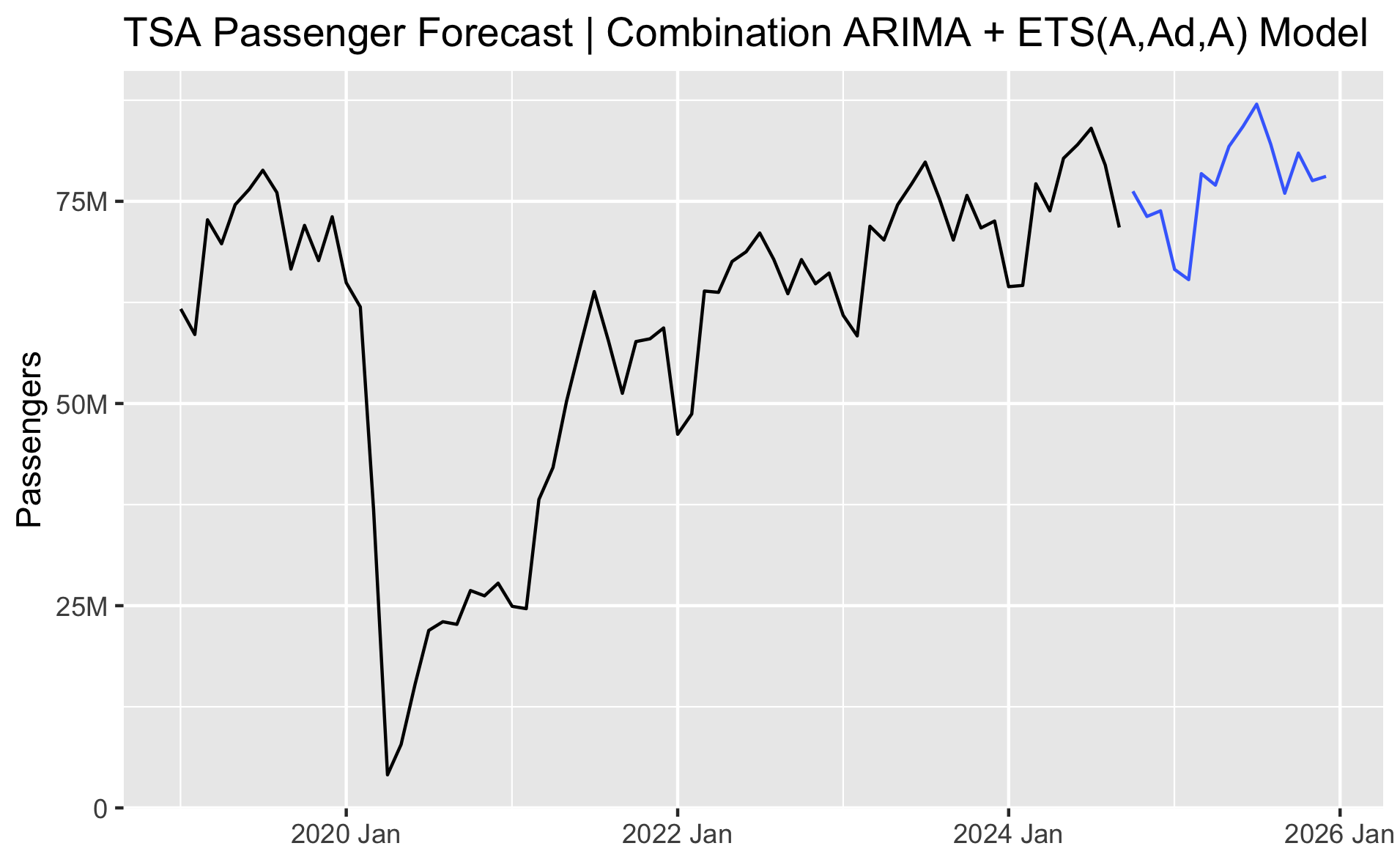
In this case, we're forecasting through the end of this year and through all of next year. Let's look at what the forecast is telling us the total annual volume and growth will be in TSA passengers for this year and next.
                    # Calculate annual volume and percent change in TSA Passengers
                    df |>
                        as_tibble() |>
                        mutate(Year = year(date)) |>
                        group_by(Year) |>
                        summarize(passengers = sum(passengers)) |>
                        arrange(Year) |>
                        mutate(pct_chg = percent((passengers / lag(passengers) - 1)))
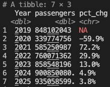
The forecast is showing 2024 will finish the year up +4.9% and 2025 will grow +3.8%, which sounds reasonable.
# Forecasting TSA Passenger data with R ----------------------------------------
# Standard packages
library(readr)
library(dplyr)
library(lubridate)
library(tidyr)
library(ggplot2)
library(scales)
library(forcats)
library(gt)
# Tidy time series packages
library(tsibble)
library(fable)
library(feasts)
# Read in and prepare data. Plot full history.
prepare_data <- function(){
# Read in data
df <- read_csv('tsa.csv')
tail(df)
# Sum passengers by month
df <- df |>
group_by(date = floor_date(date, "month")) |>
summarise(passengers = sum(passengers)) |>
# Exclude any extra dates in the current month where we don't have a full month of data
filter(date < floor_date(today(), "month"))
# Convert data to tsibble
df <- df |> mutate(date = yearmonth(date))
df <- df |> as_tsibble(index = date)
# Plot data and return tsibble dataframe
autoplot(df, passengers) +
ggtitle("TSA Passenger History") +
scale_y_continuous(
name="Passengers",
labels=label_number(scale_cut = cut_short_scale())
) +
theme(axis.title.x = element_blank())
ggsave("images/tsa-passenger-history.png", width=16.18, height=10, units='cm')
return(df)
}
# Time series decomposition
stl_decomposition <- function(df){
dcmp <- df |>
model(stl = STL(passengers))
components(dcmp) |>
autoplot() +
scale_y_continuous(
name="Passengers",
labels=label_number(scale_cut = cut_short_scale())
)
ggsave("images/time-series-decomposition.png", width=16.18, height=10, units='cm')
}
# Compare models using train test split
train_test_models <- function(df){
# The models will be more accurate if we ignore pre-Covid
df <- df |> filter_index("2020-04" ~ .)
# Split data into train/test sets
size_of_data <- nrow(df)
size_of_test <- round(size_of_data * 0.15)
train <- df |> slice_head(n = size_of_data - size_of_test)
test <- df |> slice_tail(n = size_of_test)
months_to_forecast <- nrow(test)
# Forecast with fable
fit <- train |> model(
# Baseline models
mean = MEAN(passengers),
naive = NAIVE(passengers),
drift = NAIVE(passengers ~ drift()),
snaive = SNAIVE(passengers),
# tslm = TSLM(passengers ~ trend() + season()),
# Auto-ARIMA and Auto-ETS models
arima = ARIMA(passengers, stepwise=FALSE, approximation=FALSE),
# ets = ETS(passengers),
# ETS models
ets_aaa = ETS(passengers ~ error('A') + trend('A') + season('A')),
ets_aada = ETS(passengers ~ error('A') + trend('Ad') + season('A')),
ets_aam = ETS(passengers ~ error('A') + trend('A') + season('M')),
ets_aadm = ETS(passengers ~ error('A') + trend('Ad') + season('M'))
)
# Generate forecasts
fcst <- fit |> forecast(h = months_to_forecast)
# View model forecast accuracy against test set
accuracy(fcst, df) |>
arrange(RMSE) |>
print()
# Create combined models
fcst <- fit |> mutate(
arima_ets_aaa = (arima + ets_aaa) / 2,
arima_ets_aada = (arima + ets_aada) / 2,
) |> forecast(h = months_to_forecast)
# View model forecast accuracy against test set
accuracy(fcst, df) |>
arrange(RMSE) |>
print()
# Plot results
autoplot(filter(fcst, .model %in% c(
'arima',
'ets_aaa',
'ets_aada',
'arima_ets_aaa',
'arima_ets_aada'
)), df, level = NULL) +
ggtitle("Top Forecast Models by RMSE on TSA Passenger Test Data") +
scale_y_continuous(
name="Passengers",
labels=label_number(scale_cut = cut_short_scale())
) +
theme(axis.title.x = element_blank())
ggsave("images/train-test-top-forecast-models.png", width=16.18, height=10, units='cm')
}
# Compare models using cross-validation
perform_cross_validation <- function(df){
# Create cross-validation dataset
df_tr <- df |>
filter_index("2020-04" ~ .) |>
# We need at least two years of data in order to fit the seasonal ETS models
# This starts our base data with 24 months and increases each iteration by 1 month
stretch_tsibble(.init=24, .step=1) |>
# We want to forecast 12 months out in each iteration, so the last test set
# can only have data through August 2023. This removes the last 12 monthly test sets.
filter(!(.id %in% tail(unique(.id), 12)))
# Fit models to CV dataset
fit <- df_tr |> model(
# Baseline models
mean = MEAN(passengers),
naive = NAIVE(passengers),
drift = NAIVE(passengers ~ drift()),
snaive = SNAIVE(passengers),
# tslm = TSLM(passengers ~ trend() + season()),
# Auto-ARIMA and Auto-ETS models
arima = ARIMA(passengers, stepwise=FALSE, approximation=FALSE),
# ets = ETS(passengers),
ets_aaa = ETS(passengers ~ error('A') + trend('A') + season('A')),
ets_aada = ETS(passengers ~ error('A') + trend('Ad') + season('A')),
# Add combined models
) |> mutate(
arima_ets_aaa = (arima + ets_aaa) / 2,
arima_ets_aada = (arima + ets_aada) / 2,
)
# Forecast 12 months ahead for each iteration
fcst <- fit |>
forecast(h = 12)|>
group_by(.id, .model) |>
mutate(h = row_number()) |>
ungroup() |>
# Need to convert back to a fable (forecast table) to use in the accuracy() function next
as_fable(response = "passengers", distribution = passengers)
# Print model accuracy
accuracy(fcst, df) |> arrange(RMSE) |> print()
# Plot forecast accuracy by months out
accuracy(fcst |> group_by(h), df) |>
filter(!(.model %in% c(
'drift',
'mean',
'naive',
'snaive',
'tslm'
))) |>
ggplot(mapping = aes(x = h, y = RMSE, color = .model)) +
geom_line() +
labs(
title = "TSA Passenger History",
x = "Forecast RMSE N Months Out"
) +
scale_y_continuous(
name="RMSE",
labels=label_number(scale_cut = cut_short_scale())
) +
scale_x_continuous(
breaks = seq(1, 12)
) +
theme(panel.grid.minor = element_blank())
ggsave("images/cross-validation-forecast-error.png", width=16.18, height=10, units='cm')
}
# Forecast data using chosen model
final_forecast <- function(df){
# Forecast data using chosen models
# The models will likely be more accurate if we ignore pre-Covid
df_hist <- df
df <- df |> filter_index("2020-04" ~ .)
# Find number of months to forecast if we want a forecast through 2025
months_to_forecast <- lubridate::interval(
ym(max(df$date)) + months(1), ymd('2026-01-01')
) %/% months(1)
# Fit models
fit <- df |> model(
arima = ARIMA(passengers, stepwise=FALSE, approximation=FALSE),
ets_aada = ETS(passengers ~ error('A') + trend('Ad') + season('A')),
) |> mutate(
arima_ets_aada = (arima + ets_aada) / 2
)
# Forecast
fcst <- fit |> forecast(h = months_to_forecast)
# Plot all three forecasts with prediction intervals
autoplot(fcst, df) +
ggtitle("TSA Passenger Forecast | ARIMA, ETS(A,Ad,A), and Combination") +
scale_y_continuous(
name="Passengers",
labels=label_number(scale_cut = cut_short_scale())
) +
theme(axis.title.x = element_blank())
ggsave("images/final-forecast-three-models.png", width=16.18, height=10, units='cm')
# Plot final combination model point forecast
fcst <- fcst |> filter(.model == 'arima_ets_aada')
autoplot(fcst, df_hist, level = NULL) +
ggtitle("TSA Passenger Forecast | Combination ARIMA + ETS(A,Ad,A) Model") +
scale_y_continuous(
name="Passengers",
labels=label_number(scale_cut = cut_short_scale())
) +
theme(axis.title.x = element_blank())
ggsave("images/final-forecast.png", width=16.18, height=10, units='cm')
return(fcst)
}
# Calculate annual volume and percent change
calculate_annual_change <- function(df, fcst){
fcst <- fcst |>
as_tibble() |>
select(date, .mean) |>
rename(passengers = .mean)
df <- bind_rows(df, fcst)
# Calculate annual volume and percent change in TSA Passengers
df |>
as_tibble() |>
mutate(Year = year(date)) |>
group_by(Year) |>
summarize(passengers = sum(passengers)) |>
arrange(Year) |>
mutate(pct_chg = percent((passengers / lag(passengers) - 1))) |>
print()
}
# Run code
df <- prepare_data()
stl_decomposition(df)
train_test_models(df)
perform_cross_validation(df)
fcst <- final_forecast(df)
calculate_annual_change(df, fcst)