2022-06-24
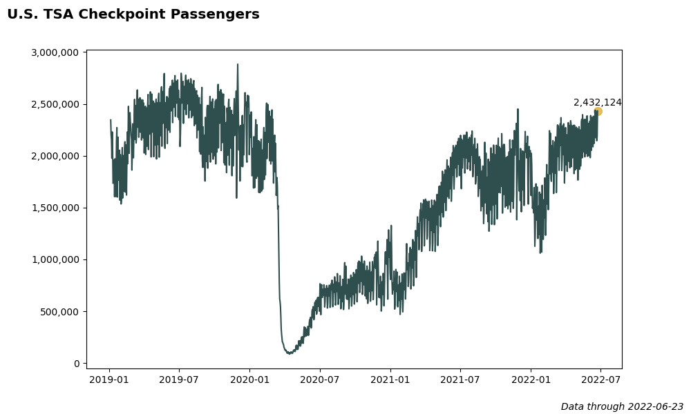
At the start of the Covid-19 outbreak, the U.S. Transportation Security Administration began sharing TSA security checkpoint passenger throughput numbers.
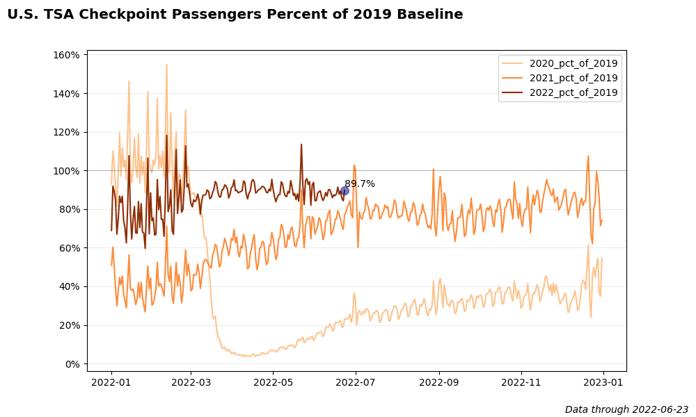
Below are several plots created with Matplotlib showing the trend of TSA passengers through the pandemic. The code for these charts is stored on GitHub here.
        import pandas as pd
        import matplotlib.pyplot as plt
        from matplotlib import cm


        def plot_trend(width=10, height=6, show_plot=False):
            '''Plot complete trend of data.'''

            df = pd.read_csv('data/tsa.csv')
            df['Date'] = pd.to_datetime(df['Date'])
            latest_date = max(df['Date']).strftime('%Y-%m-%d')

            # Plot data
            plt.figure(figsize=(width, height))
            plt.plot(df['Date'], df['Passengers'], color='darkslategray')
            plt.suptitle('U.S. TSA Checkpoint Passengers',
                         x=0.01,
                         y=0.98,
                         fontweight='bold',
                         fontsize='x-large',
                         horizontalalignment='left')
            plt.figtext(0.99, 0.01, 'Data through ' + latest_date,
                        ha = 'right',
                        fontstyle='italic')
            # Convert axis labels to commas and remove scientific notation
            current_values = plt.gca().get_yticks()
            plt.gca().set_yticklabels(['{:,.0f}'.format(x) for x in current_values])

            # Highlight latest data point
            latest_number = df[df['Date'] == latest_date]['Passengers']
            latest_number = int(latest_number.iloc[0])
            plt.scatter(pd.to_datetime(latest_date),
                        latest_number,
                        color='goldenrod',
                        alpha=0.7,
                        s=70)
            plt.annotate("{:,}".format(latest_number),
                         xy=(pd.to_datetime(latest_date), latest_number * 1.02),
                         horizontalalignment='center'
                        )

            plt.savefig('images/tsa-full-trend.png')
            if show_plot:
                plt.show()
            print('Trend chart created.')
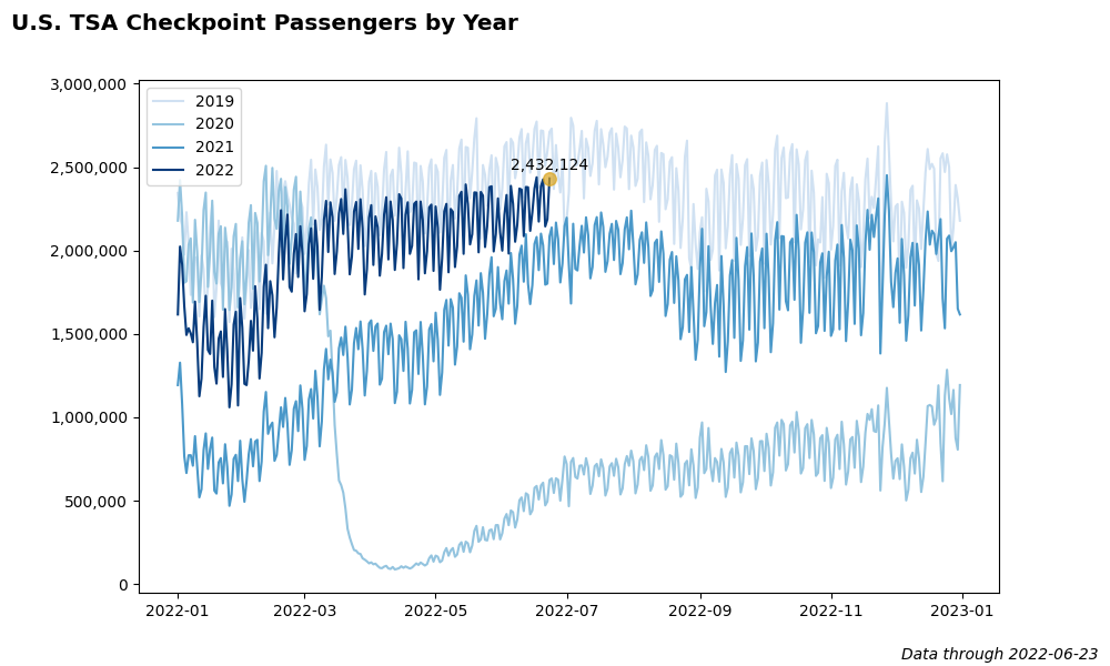
        def plot_trend_by_year(width=10, height=6, show_plot=False):
          '''Plot trend of data by year.'''
          # Get latest date
          df = pd.read_csv('data/tsa.csv')
          df['Date'] = pd.to_datetime(df['Date'])
          latest_date = max(df['Date']).strftime('%Y-%m-%d')

          df = pd.read_csv('data/tsa-by-year.csv')
          df['Date'] = pd.to_datetime(df['Date'])

          # Get year labels from columns
          years = df.columns[1:].sort_values()
          num_years = len(years)

          # Create colors for each year
          cmap = cm.get_cmap('Blues')
          colors = [0.2, 0.4, 0.6, 0.95]

          plt.figure(figsize=(width, height))
          for i in range(num_years):
              plt.plot(df['Date'],
                      df[years[i]],
                      label=years[i],
                      color=cmap(colors[i])
                      )
          plt.legend()
          plt.suptitle('U.S. TSA Checkpoint Passengers by Year',
                      x=0.01,
                      y=0.98,
                      fontweight='bold',
                      fontsize='x-large',
                      horizontalalignment='left')
          plt.figtext(0.99, 0.01, 'Data through ' + latest_date,
                      ha = 'right',
                      fontstyle='italic')
          # Highlight latest data point
          latest_number = df[df['Date'] == latest_date]['2022']
          latest_number = int(latest_number.iloc[0])
          plt.scatter(pd.to_datetime(latest_date),
                      latest_number,
                      color='goldenrod',
                      alpha=0.7,
                      s=70,
                      zorder=2.5)
          plt.annotate("{:,}".format(latest_number),
                      xy=(pd.to_datetime(latest_date), latest_number * 1.02),
                      horizontalalignment='center'
                      )

          # Convert axis labels to commas and remove scientific notation
          current_values = plt.gca().get_yticks()
          plt.gca().set_yticklabels(['{:,.0f}'.format(x) for x in current_values])

          plt.savefig('images/tsa-by-year.png')
          if show_plot:
              plt.show()
          print('Trend chart by year created.')
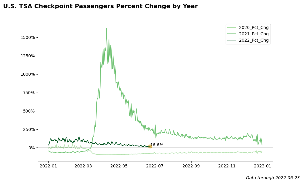
        def plot_percent_change_trend_by_year(width=10, height=6, show_plot=False):
            '''Plot percent change trend by year.'''
            # Get latest date
            df = pd.read_csv('data/tsa.csv')
            df['Date'] = pd.to_datetime(df['Date'])
            latest_date = max(df['Date']).strftime('%Y-%m-%d')

            # Read in data by year
            df = pd.read_csv('data/tsa-by-year.csv')
            df['Date'] = pd.to_datetime(df['Date'])

            # Calculate year-over-year percent change
            df['2022_Pct_Chg'] = (df['2022'] / df['2021']) - 1
            df['2021_Pct_Chg'] = (df['2021'] / df['2020']) - 1
            df['2020_Pct_Chg'] = (df['2020'] / df['2019']) - 1

            df = df[['Date', '2022_Pct_Chg', '2021_Pct_Chg', '2020_Pct_Chg']]

            # Get year labels from columns
            years = df.columns[1:].sort_values()
            num_years = len(years)

            # Create colors for each year
            cmap = cm.get_cmap('Greens')
            colors = [0.3, 0.5, 0.95]

            plt.figure(figsize=(width, height))
            for i in range(num_years):
                plt.plot(df['Date'],
                        df[years[i]],
                        label=years[i],
                        color=cmap(colors[i])
                        )
            plt.legend()
            plt.suptitle('U.S. TSA Checkpoint Passengers Percent Change by Year',
                        x=0.01,
                        y=0.98,
                        fontweight='bold',
                        fontsize='x-large',
                        horizontalalignment='left')
            plt.figtext(0.99, 0.01, 'Data through ' + latest_date,
                        ha = 'right',
                        fontstyle='italic')

            # Add line at zero
            plt.axhline(y=0, color='black', alpha=0.25, linewidth=0.7)

            # Highlight latest data point
            latest_pct_chg = df[df['Date'] == latest_date]['2022_Pct_Chg']
            latest_pct_chg = latest_pct_chg.iloc[0]
            plt.scatter(pd.to_datetime(latest_date),
                        latest_pct_chg,
                        color='goldenrod',
                        alpha=0.7,
                        s=70)
            plt.annotate("{:.1%}".format(latest_pct_chg),
                        xy=(pd.to_datetime(latest_date), latest_pct_chg * 1.2)
                        )

            # Convert axis labels to commas and remove scientific notation
            current_values = plt.gca().get_yticks()
            plt.gca().set_yticklabels(['{:.0%}'.format(x) for x in current_values])

            plt.savefig('images/tsa-pct-chg-by-year.png')
            if show_plot:
                plt.show()
            print('Percent change trend chart by year created.')
        def plot_percent_of_2019_by_year(width=10, height=6, show_plot=False):
            '''Plot percent of 2019 baseline by year.'''
            # Get latest date
            df = pd.read_csv('data/tsa.csv')
            df['Date'] = pd.to_datetime(df['Date'])
            latest_date = max(df['Date']).strftime('%Y-%m-%d')

            # Read in data by year
            df = pd.read_csv('data/tsa-by-year.csv')
            df['Date'] = pd.to_datetime(df['Date'])

            # Calculate percent of 2019 for each year
            df['2022_pct_of_2019'] = df['2022'] / df['2019']
            df['2021_pct_of_2019'] = df['2021'] / df['2019']
            df['2020_pct_of_2019'] = df['2020'] / df['2019']

            df = df[['Date', '2022_pct_of_2019', '2021_pct_of_2019', '2020_pct_of_2019']]

            # Get year labels from columns
            years = df.columns[1:].sort_values()
            num_years = len(years)

            # Create colors for each year
            cmap = cm.get_cmap('Oranges')
            colors = [0.3, 0.5, 0.95]

            plt.figure(figsize=(width, height))
            for i in range(num_years):
                plt.plot(df['Date'],
                        df[years[i]],
                        label=years[i],
                        color=cmap(colors[i])
                        )
            plt.legend()
            plt.suptitle('U.S. TSA Checkpoint Passengers Percent of 2019 Baseline',
                        x=0.01,
                        y=0.98,
                        fontweight='bold',
                        fontsize='x-large',
                        horizontalalignment='left')
            plt.figtext(0.99, 0.01, 'Data through ' + latest_date,
                        ha = 'right',
                        fontstyle='italic')

            # Add line at 100%
            # plt.axhline(y=0, color='black', alpha=0.25, linewidth=0.7)
            plt.axhline(y=1, color='black', alpha=0.25, linewidth=0.7)

            # Highlight latest data point
            latest_pct_chg = df[df['Date'] == latest_date]['2022_pct_of_2019']
            latest_pct_chg = latest_pct_chg.iloc[0]
            plt.scatter(pd.to_datetime(latest_date),
                        latest_pct_chg,
                        color='navy',
                        alpha=0.5,
                        s=70,
                        zorder=2.5)
            plt.annotate("{:.1%}".format(latest_pct_chg),
                        xy=(pd.to_datetime(latest_date), latest_pct_chg * 1.02)
                        )

            plt.grid(visible=True, axis='y', alpha=0.25)

            # Convert axis labels to commas and remove scientific notation
            current_values = plt.gca().get_yticks()
            plt.gca().set_yticklabels(['{:.0%}'.format(x) for x in current_values])

            plt.savefig('images/tsa-pct-of-2019.png')
            if show_plot:
                plt.show()
            print('Percent of 2019 trend chart by year created.')
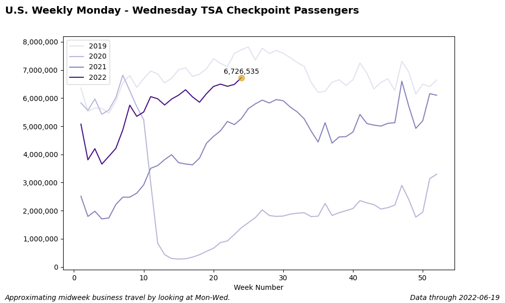
        def plot_weekly_midweek_trend_by_year(width=10, height=6, show_plot=False):
            '''Plot weekly Monday - Wednesday trend of TSA checkpoint passnegers by year.
            Monday - Wednesday are peak business travel times, so this gives a rough
            approximation of business travel trends.'''

            # Get latest date
            df = pd.read_csv('data/tsa.csv')
            df['Date'] = pd.to_datetime(df['Date'])
            latest_date = max(df['Date']).strftime('%Y-%m-%d')
            latest_week_number = pd.to_datetime(latest_date).week

            # Check if we have a full week of new data, if not then we'll need to delete
            # any recent days until we have a full week of data.
            if pd.to_datetime(latest_date).dayofweek == 6:
                full_week_of_data = True
            else:
                full_week_of_data = False

            # Read in data by year, create week number and day-of-week fields
            df = pd.read_csv('data/tsa-by-year.csv')
            df['Date'] = pd.to_datetime(df['Date'])
            df['Week'] = df['Date'].dt.week
            df['DOW'] = df['Date'].dt.dayofweek

            # If we don't have a full week of new data, then delete the partial week of
            # data for the current week.
            if full_week_of_data == False:
                df.loc[df['Week'] == latest_week_number, '2022'] = np.nan

            # Adjusted latest_date to the most recent end-of-week date for which we have
            # complete weekly data.
            latest_date = max(df.loc[df['2022'] >= 0, 'Date']).strftime('%Y-%m-%d')

            # Filter for only Mon - Wed dates. Monday = 0, Tuesday = 1, etc.
            # https://pandas.pydata.org/docs/reference/api/pandas.DatetimeIndex.dayofweek.html
            df = df[df['DOW'].isin([0, 1, 2])]
            df = df.drop(columns=['DOW', 'Date'])
            df = df.groupby(by='Week').sum()
            df = df.reset_index()

            # When doing the groupby and sum, any future 2022 values become 0, so we
            # need to reset then to NaN.
            df.loc[df['2022'] == 0, '2022'] = np.nan

            # Get year labels from columns
            years = df.columns[1:].sort_values()
            num_years = len(years)

            # Create colors for each year
            cmap = cm.get_cmap('Purples')
            colors = [0.2, 0.4, 0.6, 0.95]

            plt.figure(figsize=(width, height))
            for i in range(num_years):
                plt.plot(df['Week'],
                        df[years[i]],
                        label=years[i],
                        color=cmap(colors[i])
                        )
            plt.legend()
            plt.xlabel('Week Number')
            plt.suptitle('U.S. Weekly Monday - Wednesday TSA Checkpoint Passengers',
                        x=0.01,
                        y=0.98,
                        fontweight='bold',
                        fontsize='x-large',
                        horizontalalignment='left')
            plt.figtext(0.99, 0.01, 'Data through ' + latest_date,
                        ha = 'right',
                        fontstyle='italic')
            plt.figtext(0.01, 0.01, 'Approximating midweek business travel by looking at Mon-Wed.',
                        ha = 'left',
                        fontstyle='italic')

            # Highlight latest data point
            if full_week_of_data == False:
                latest_week_number = latest_week_number - 1

            latest_number = df[df['Week'] == latest_week_number]['2022']
            latest_number = int(latest_number.iloc[0])
            plt.scatter(latest_week_number,
                        latest_number,
                        color='goldenrod',
                        alpha=0.7,
                        s=70,
                        zorder=2.5)
            plt.annotate("{:,}".format(latest_number),
                        xy=(latest_week_number, latest_number * 1.02),
                        horizontalalignment='center'
                        )

            # Convert axis labels to commas and remove scientific notation
            current_values = plt.gca().get_yticks()
            plt.gca().set_yticklabels(['{:,.0f}'.format(x) for x in current_values])

            plt.savefig('images/tsa-midweek-by-year.png')
            if show_plot:
                plt.show()
            print('Midweek business travel trend chart by year created.')