2020-08-04
For my first #TidyTuesday we're looking at energy production in European countries. I'm interested to see which countries have the largest portion of nuclear energy production. It turns out that France, Slovakia, Ukraine, and Hungary are the only countries in Europe that have 50% or more of their power produced from nuclear energy.
library(readr)
    library(dplyr)
    library(ggplot2)
    library(forcats)
# Get Data
energy_types <- readr::read_csv('https://raw.githubusercontent.com/rfordatascience/tidytuesday/master/data/2020/2020-08-04/energy_types.csv')## Parsed with column specification:
## cols(
## country = col_character(),
## country_name = col_character(),
## type = col_character(),
## level = col_character(),
## `2016` = col_double(),
## `2017` = col_double(),
## `2018` = col_double()
## )country_totals <- readr::read_csv('https://raw.githubusercontent.com/rfordatascience/tidytuesday/master/data/2020/2020-08-04/country_totals.csv')## Parsed with column specification:
## cols(
## country = col_character(),
## country_name = col_character(),
## type = col_character(),
## level = col_character(),
## `2016` = col_double(),
## `2017` = col_double(),
## `2018` = col_double()
## )# We will only be using energy_types
glimpse(energy_types)## Rows: 296
## Columns: 7
## $ country <chr> "BE", "BE", "BE", "BE", "BE", "BE", "BE", "BE", "BG", ...
## $ country_name <chr> "Belgium", "Belgium", "Belgium", "Belgium", "Belgium",...
## $ type <chr> "Conventional thermal", "Nuclear", "Hydro", "Pumped hy...
## $ level <chr> "Level 1", "Level 1", "Level 1", "Level 2", "Level 1",...
## $ `2016` <dbl> 30728.00, 41430.00, 1476.00, 1110.00, 5340.00, 3070.00...
## $ `2017` <dbl> 31316.000, 40128.500, 1360.900, 1093.200, 6387.900, 32...
## $ `2018` <dbl> 30092.635, 26995.628, 1239.248, 983.190, 7177.346, 348...The only cleanup we need to perform is filling in NA values for the UK country name. country_name is listed as NA for the United Kingdom in the data.
# Fill in NA values for UK.
    energy_types$country_name[is.na(energy_types$country_name) & energy_types$country == "UK"] <- "United Kingdom"
I'm interested in plotting each country's energy production as a percent of their total to see which countries have the highest nuclear power production. In order to show nuclear energy clearly in the graph, I'd like to show nuclear as the first energy type and sort the countries by their percent of nuclear from largest to smallest.
To do this we will need to created ordered factors for the type and country_name fields:
forcats::fct_relevel to bring Nuclear up to the first place in the factor order. This then leaves the rest of the levels in their default alphabetical order, which is fine for now.# Reorder Nuclear to be the first energy type in the legend.
energy_types$type <- forcats::fct_relevel(energy_types$type, "Nuclear")
levels(energy_types$type)## [1] "Nuclear" "Conventional thermal" "Geothermal"
## [4] "Hydro" "Other" "Pumped hydro power"
## [7] "Solar" "Wind"dplyr::pull() to convert the resulting data frame column to a vector of values. We'll then use this vector of ordered country names to make the country_name field a factor with the ordering needed for our chart.# Get list of country names ordered by nuclear's percent of total.
# This list will be used later to order the factor for sorting on the chart.
nuc_ctrys <- energy_types %>%
group_by(country_name) %>%
mutate(nuc_pct = `2018`/sum(`2018`)) %>%
filter(type == "Nuclear") %>%
arrange(desc(nuc_pct)) %>%
select(country_name) %>%
pull()
# Make country_name a factor based on the order we made earlier.
energy_types$country_name <- factor(energy_types$country_name, nuc_ctrys)Finally, let's plot our data.
ggplot2::geom_bar to make a bar chart.fill=type means that we want to color each bar section based on the energy type field.stat="identity" indicates that we are simply using the values for the field 2018 as they exist in the data frame, without performing any aggregation or count.position="fill" specifies that we want to look at each bar breakdown as a percent of the total, so each bar is showing the breakdown out of 100% that each energy type represents. It handles that calculation for us, we don't need to do anything special.# Create plot.
energy_types %>%
ggplot() +
geom_bar(aes(x=country_name, y=`2018`, fill=type), stat = "identity", position = "fill") +
theme_classic() +
theme(axis.text.x = element_text(angle = 90, hjust = 1, vjust = 0.25, face = "bold", size = 8),
axis.title.x = element_blank(),
plot.title = element_text(face = "bold"),
plot.subtitle = element_text(face = "italic"),
plot.caption = element_text(hjust = 1.48)) +
labs(title = "How do European countries produce their energy?",
subtitle = "2018 percent of total",
caption = "Source: Eurostat",
y = "Percent of Power Generation") +
guides(fill = guide_legend(title = "Energy Type")) +
scale_y_continuous(labels = scales::percent)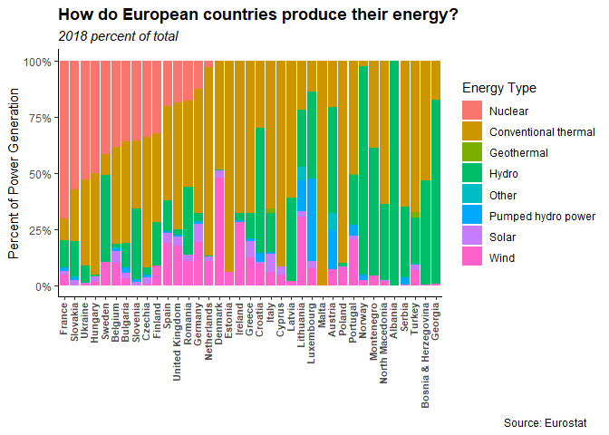
The salmon colored sections of the bars are our nuclear energy percentages. They're showing up top left in descending order because we specified that nuclear should be first in the energy type factor order and because we specified the country sort order based on the percentage use of nuclear energy.
Let's save our image as a separate file with ggplot2::ggsave().
ggsave("nuclear-energy.png")