2020-08-17
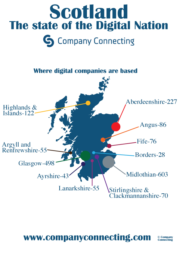
Great Scott! This week's #MakeoverMonday looks at where digital companies are located in Scotland.
Here's the original visualization that we're making over:

There are a few things we can do to clean up the visualization.
Remove the colors from the circles, they aren't adding much to the visual. The main message is how the size of the circles differs.
Remove the lines connecting the circles to the labels, we can simply adjust the labels to fit closer in.
Let's be consistent about using “&” or “and” in labels.
I've opted for a larger map with overlaid circles representing the number of companies in each location. In order to do this we need to use dual-axis maps, and I found this Tableau Knowledge Base article very helpful: Tableau Dual Axis Maps
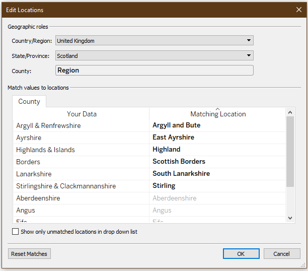
I added an additional Country field to the data populated with “Scotland” so that Tableau could map the country. The Region field contains location names that most closely match to County in Tableau, and not all of the names match exactly.
I had to manually select Matching Locations for the unknown regions - this was an imperfect process as the Region field in the data contains some combinations of locations that Tableau has listed separately. For this visual, that is ok. If we wanted to be extra precise about where the labels are placed, we could add lat/long coordinates in the data.

Some of the Region names are very long and make it difficult to fit the mark labels together on the map. Sadly, turning on “Wrap” in the Label Alignment does nothing.
I forced the labels with two names to wrap using the calculated field below. Big thanks to @dataunjaded's blog for the help on this wrapping calculated field.
                  // Only operates on labels with "&".
                  if contains([Region], "&") then

                  // Split on "& " and add in a new line between the two names.
                  split([Region], "& ", 1)
                  + "&" +
                  '
                  '
                  + split([Region], "& ", 2)

                  else Region
                  end
Thanks to tailorbrands.com for the color inspiration.